Are Kitchen Signs Still in Style in 2026? A Clear Answer

Kitchen signs are still in style in 2026, but only about half of what people mean by “kitchen sign” survived the last few years. The category split. Handmade, personal and genuinely useful signage is doing fine. The mass-produced distressed plaque with a printed slogan is the piece that now reads as dated, and it dates a room faster than almost any other object in it.
That distinction matters more than a yes or no, because it is the thing that tells you whether to keep the sign you already own.
What actually went out of style
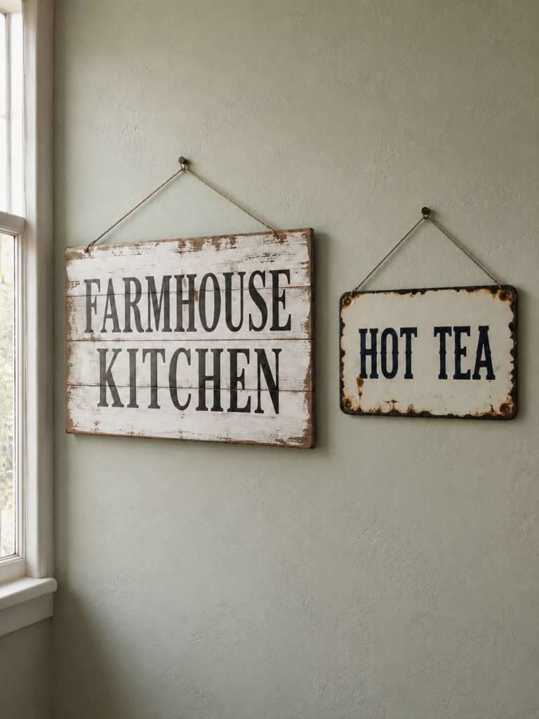
The look that peaked between roughly 2015 and 2020 had a very specific formula: a rectangular MDF or thin pine panel, whitewashed or distressed at the edges, printed in a heavy serif or a script font, carrying a phrase addressed to nobody in particular. Gather. Bless This Mess. Live, laugh, love. The phrase was the entire design, and the same phrase hung in several million kitchens.
Two things killed it. The first was volume, since a piece that is everywhere stops functioning as decoration and starts functioning as a date stamp, the way a specific shade of avocado green does. The second was the printing. Once big-box retailers moved from routed or painted lettering to flat digital printing on wood-look board, the object stopped reading as handmade while still pretending to be, and that gap is visible from across a room.
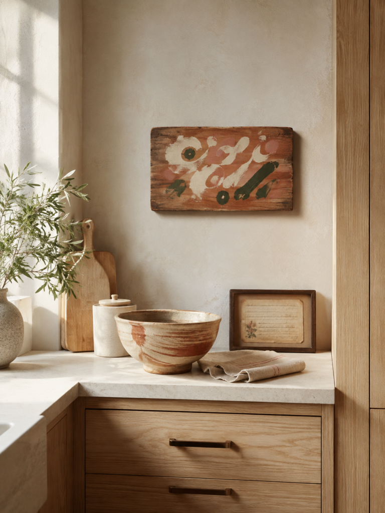
What survived was everything that had a reason to exist beyond filling a blank wall: hand-lettered pieces, vintage enamel and trade signage with real provenance, chalkboards and slate that people actually write on, and personalized pieces tied to a specific family, business or place.
Why 2026 kitchens push signs to the edges
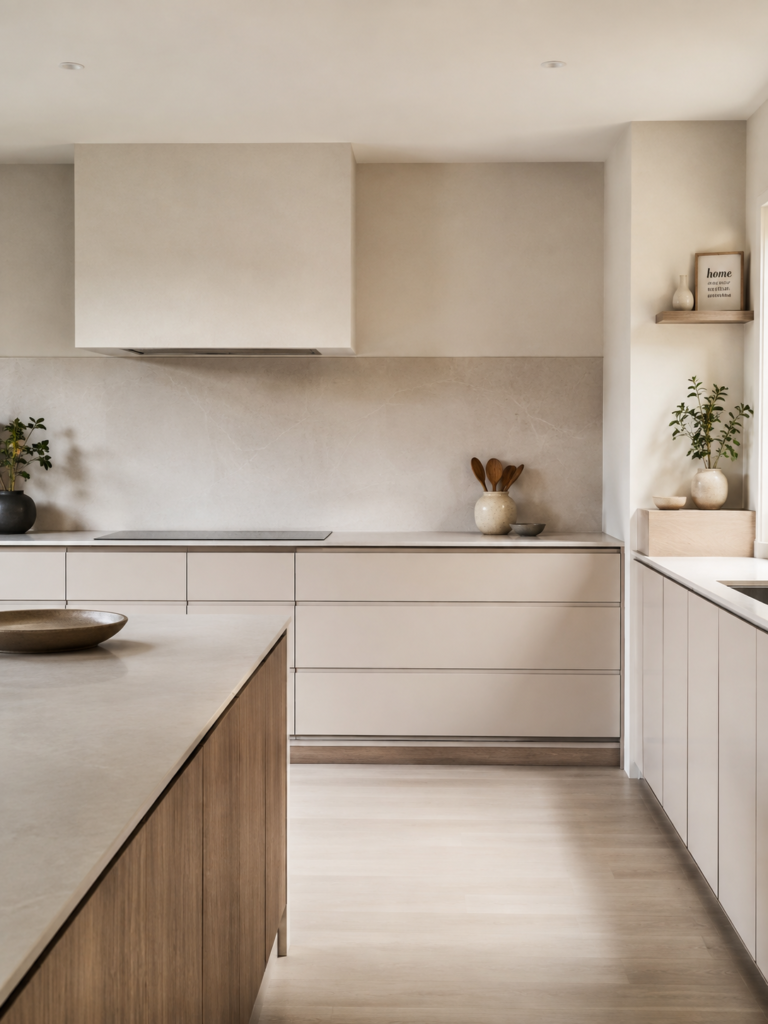
Kitchen design has moved toward quieter surfaces, and quieter surfaces are less forgiving of visual noise.
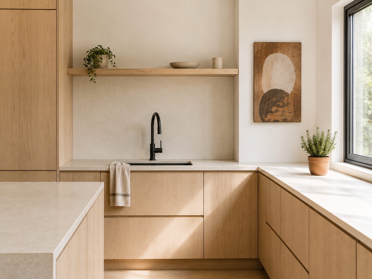
The National Kitchen and Bath Association surveyed 634 kitchen and bath professionals for its 2026 Kitchen Trends Report and found neutrals named by 96% of respondents as the dominant color direction, with transitional and timeless styling leading at 72% and minimalism at 60%. The report also describes the next three years as swapping intricate detail for minimal detail, with flat slab cabinet doors and solid-surface backsplashes gaining ground.
A room built that way has fewer places for a busy object to hide. Against a heavily patterned tiled backsplash and ornate cabinetry, a distressed sign was one texture among many. Against a slab backsplash and flat-front cabinets, it is the only competing element in view, and it draws every eye in the room.
There is a useful detail in the same research, though. When asked where new statement color would land, respondents pointed to decorative accessories at 55%, roughly level with the island. The pared-back kitchen has not banned personality. It has concentrated it into fewer, more deliberate objects. A sign can absolutely be one of them. It just has to earn the slot, because there are now three or four of these slots in a kitchen rather than twenty.
Personalisation is working in the sign’s favour
The wider consumer picture points the other way, which is why the honest answer to this question is not a flat no.
Pinterest’s 2026 trend forecast, drawn from search behavior across its 600 million monthly users, frames the year around identity curation rather than trend-following. It reports that 42% of global respondents say they only take part in trends that suit them, and that comfort and nostalgia are driving a large share of what people save. Pinterest’s own note on accuracy is that 88% of its predictions over the past six years have come true, which is worth reading as a company’s own self-assessment rather than an independent audit, but the direction is consistent with what the kitchen research shows.
A wall piece that says something true about the household sits comfortably inside that shift. A wall piece bought because a store aisle was full of them does not. The dividing line in 2026 is not decorative versus plain. It is specific versus generic.
Five questions to ask about the sign you already own
Rather than guessing, run the piece through this. If it fails three or more, it is probably the thing making your kitchen feel a few years behind.
- Could you have bought this in a supermarket seasonal aisle? Wide distribution is the single strongest predictor that a piece has dated.
- Is the text the only design element? Signs that work usually have something else going on: material, age, shape, craft. Signs that fail are a font on a rectangle.
- Is the lettering printed, or is it painted, carved, cast or enamelled? Flat print on wood grain is the tell.
- Is the distressing real? Genuine wear happens at handled edges and corners. Factory distressing appears evenly across the face, including places nothing would ever touch.
- Does it mean anything specific to you? A family name, a place, a business, a joke only your household understands. If the answer is no, it is filling space rather than saying something.
A sign that passes most of these is fine to keep hanging in 2026. A sign that fails most of them is not ruined, but it belongs somewhere with a lower design bar: a garage, a utility room, a workshop, a child’s play kitchen.
What has replaced the slogan sign
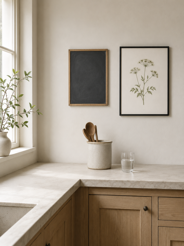
Three things, mostly.
Working surfaces. Chalkboards, slate panels and small whiteboards do the same visual job in a kitchen while also holding the shopping list. Because the content changes weekly, they never freeze in time the way a fixed phrase does.
Real vintage. Enamel advertising signs, old bakery and butcher trade boards, salvaged numerals and letters. These carry the weight and lettering people originally wanted from farmhouse signs, and because each piece is genuinely singular, it cannot become ubiquitous.
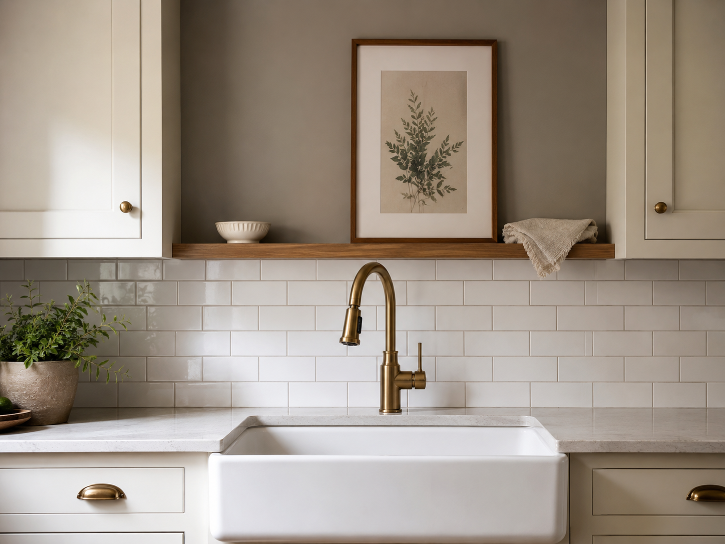
Framed non-text art. Botanical prints, food photography, small still lifes. This is where a lot of former sign budget went, and it fits the neutral, natural-materials direction the industry research describes.
personalized pieces sit across all three. A hand-painted board with a family name and a date is not the same object as a printed plaque telling you to gather, even if both are wood rectangles with words on them.
Where a sign still works in a 2026 kitchen
Placement is doing a lot of the work here, and it is where most rooms go wrong.
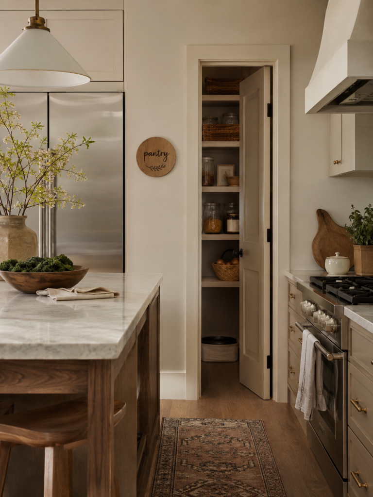
A sign reads best on a wall that has no other job: the short return wall at the end of a run of cabinets, the panel above a doorway, the wall of a breakfast nook, the side of a pantry. It reads worst directly above the range or centred on the main backsplash, which is where these pieces were most often hung, and where they compete with the busiest zone in the room.
Scale matters more than most people expect. A single piece roughly two thirds the width of the surface beneath it looks considered. Three or four small signs scattered across different walls looks like a collection nobody edited.
There is also a practical reason to keep signage away from the cooking zone. The wall directly above and beside a range takes repeated heat and airborne grease, and porous or printed surfaces absorb both. Wood, MDF and paper-faced board discolor and warp there over time in a way that glazed tile and metal do not. If a piece matters to you, hang it somewhere it will not need scrubbing.
If you are working around a lease and cannot put holes in the wall, the same reasoning applies to adhesive and leaning arrangements. Femorias covers the mechanics of that in more detail in this guide to damage-free ways to update a rented kitchen.
If you are planning to sell
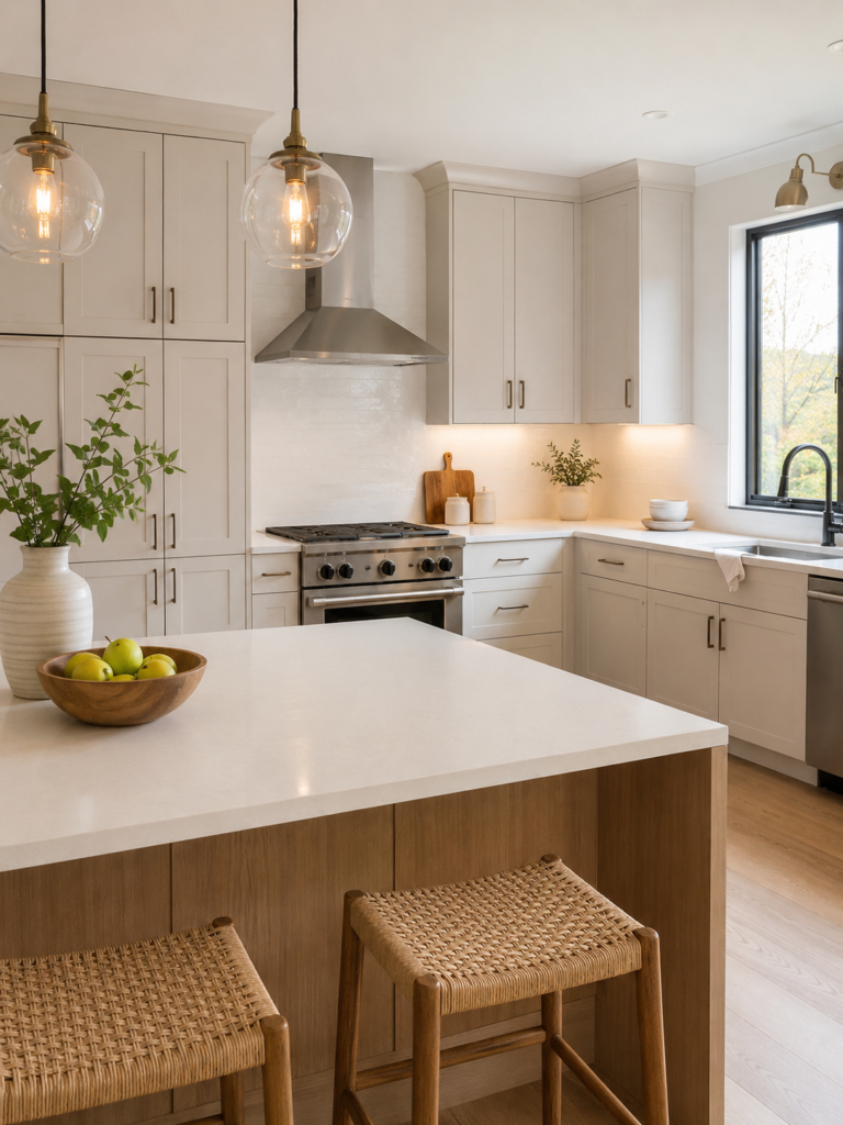
Different rules apply, and this is the one context where the answer is closer to a straight no.
Staging advice is built around helping a buyer picture themselves in the space, and personal items work directly against that. NAR’s 2025 Profile of Home Staging, based on a February 2025 survey of a random sample of its members, found that 83% of buyers’ agents said staging made it easier for a buyer to visualise a property as a future home, while 26% said staging affected most buyers’ view of the home and 60% said it affected some but not all.
Worth noting what that data does and does not say. It measures staging as a whole, not signage specifically, and no research isolates the effect of a single wall piece on a sale. But the depersonalising logic behind staging applies cleanly: a sign carrying a family name, an inside joke or a slogan is exactly the sort of item that keeps a buyer aware they are standing in someone else’s kitchen. Take it down for viewings and photographs, then put it back up in the next house.
The same survey found the living room, primary bedroom and dining room were the most commonly staged spaces, which is a reasonable guide to where to spend effort if you are doing this yourself. For the dining room in particular, Femorias has a full walkthrough of planning the space around clearances before styling it.
Common mistakes worth avoiding
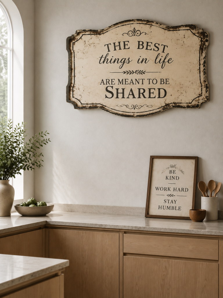
Buying a sign to fill a wall you have not decided about. Empty wall anxiety is the reason most of these pieces were bought. Leaving a wall bare for a month is a better decision than filling it with something you will resent.
Matching the sign to the trend rather than the room. A vintage French bakery board in a kitchen with no other vintage element looks like a costume. One borrowed reference needs at least one more to look intentional.
Treating “still in style” as the only question. A sign your grandmother lettered is not competing in the trend cycle at all. Personal objects operate outside it, and rooms that contain a few of them tend to age better than rooms styled entirely to a moment.
Hanging it too high. Wall pieces in a kitchen usually sit above a counter or a piece of furniture, and the gap below should read as a relationship, not a gulf. Somewhere in the region of 15 to 10 inches above the surface generally looks right, adjusted for the size of the piece.
Where that leaves you
If your kitchen sign is handmade, vintage, personal or genuinely functional, keep it. If it is a printed slogan on distressed board, it is the piece most likely to be making the room feel a few years old, and removing it will do more than anything else you could hang in its place.
The trend cycle is a poor reason to buy something and an equally poor reason to throw something out. It is a reasonable reason to ask why a particular object is on your wall, which is a question worth asking about every piece in a kitchen, not only the ones with words on them.
Frequently Asked Questions
Are farmhouse signs out of style in 2026?
The mass-produced version is, yes. Printed, evenly distressed wood plaques carrying generic phrases now read as belonging to a specific past period. Farmhouse styling itself has not disappeared, and genuine vintage signage, hand-lettered work and enamel pieces still sit comfortably in that aesthetic.
What should I hang in my kitchen instead of a sign?
Chalkboards or slate panels that hold real information, framed botanical or food prints, small mirrors, open shelving with a few well-chosen objects, or genuine vintage trade signage. The common thread is that each has a function or a history beyond covering wall space.
Do personalized kitchen signs still look current?
More so than generic ones. Consumer trend research for 2026 points consistently toward personal expression and pieces that reflect a specific household, so a name, a date or a place tends to age far better than a slogan. The quality of the making still matters: hand-painted or carved lettering holds up where flat printing does not.
Where is the best place to hang a sign in a kitchen?
On a wall with no competing function. Good spots include the short return wall at the end of a cabinet run, above a doorway, in a breakfast nook or on the side of a pantry. Avoid the wall directly above the range, both because it is visually the busiest zone and because heat and grease damage wood and printed surfaces over time.
Should I take kitchen signs down before selling my house?
For viewings and listing photographs, yes. Depersonalising is a core part of standard staging advice, and NAR’s staging research shows most buyers’ agents find staging helps buyers picture a property as their own. Signs carrying a family name or a personal phrase are exactly the kind of item that works against that.